By Kym Dakin
After my third Zoom interaction today, I’m experiencing an all too familiar feeling… I’m “Zoomed”. I’ll go out for a walk, or grab yet another coffee, or maybe just eat something I shouldn’t, but that won’t help much. Zoom and online platforms like it are convenient and all, but I’m not alone in aching for some kind of more satisfying connection with my Zoom-mates.
Luckily, the May 17th ATD program has an intriguing topic on offer: “How to Use Visual Image Cards to Create Deeper Connection.” Yippee! It sounds like just what I need, but I have to wait a whole month for that session.
In the meantime, I did some googling on these cards, and two other options: this may be just what we need to perk up these online meetings going forward.
Compatibility Communication System Cards
CCS Cards were first developed in the 90’s at the Powerhouse Museum in Sydney Australia as a series of images to gauge people’s reactions to new museum installations. From there it became a board game introduced at the 1996 World’s Fair, and eventually became the virtual training tool that Leonie Cutts, founder of the CCs Corporation, and Nancy Ancheles of Catalyst & Co. will introduce us to in their May 17th zoom presentation.
Ancheles and Cutts promise that “When used well, these deceptively simple tools can improve participation, stimulate discovery, encourage mutual disclosure and equality of voice, speed up agreement across groups and inspire collaboration and action.” Sounds like just the antidote to zoom fatigue.
But hang on, there’s more….
Data Stories: Suddenly, the Numbers Come to Life…
Finally, let’s look at tools that can create data stories - which I’ve always considered a contradiction in terms, but I’m about to be educated.
BTW, if you don’t have the tech bandwidth of a large corporation, there are services such as The DataFace or Soak or Juice Analytics who can help.
In fact, for some inspiration, Juice Analytics has come up with an intriguing list of the “20 Best Data Storytelling Examples” I’m going to highlight three of these. Warning: the topics may be depressing, but once you click on the links, you’ll see how the data comes to life by compiling numbers, language and statistics over a given span of time, exemplifying the secret sauce of a successful Data Story: data visualization, interactivity, and classic storytelling.
The Bill and Melinda Gates Foundation have put together a startlingly vivid data story pictograph for their “Goalkeepers” mission, titled Examining Inequality: How Geography and Gender Stack the Deck For or Against You.
You’ll notice three timelines with the peaks indicating the amount of obstacle present in the progression towards a healthy, productive life of Bill Gates, Melinda Gates, and a small girl born in Africa. The difference is absolutely startling. anyone looking at this gets the strong visceral message in the verbal description: “Goalkeepers is our annual report card on the world’s progress toward the Sustainable Development Goals (SDGs), 17 ambitious goals the member states of the United Nations committed to reaching by 2030. As we write, billions of people are projected to miss the targets that we all agreed represent a decent life. If we hope to accelerate progress, we must address the inequality that separates the lucky from the unlucky.”
Gun Deaths in the Periscope
Another top data story comes to us from Periscopic, and it amplifies, in a sobering build of visual data, what millions of lives taken by guns cost in years unlived. As Juice describes it “This visualization shows “stolen years” due to gun deaths. It is a masterclass in connecting your audience with the emotional message by gradually revealing the data.” We are, as a culture, becoming numb to yet another mass shooting. But there is something staggering about seeing numbers displayed this way that is hard to ignore. And that’s the point.
And You Thought it was Just You....
No wonder Americans are anxious. And The Pudding’s entry spells this out in “30 Years of American Anxieties” by compiling “Dear Abby” letters over a 3 decade span of time. This entry creates, by analyzing the questions and emotions in over 20,000 letters, a visual story of the internal worries of Americans over time. Clicking on the link will give you a deep dive into some of the top sources of stress: sex, religion, and LBGTQ issues.
Now that we’re all stressed and anxious - it’s time for a treat, and this just could be better than chocolate! (But speaking of chocolate - this link will get you to a delicious - and PRETTY source: Chocolats Passion on Brackett Street in Portland, Maine. Not a Mainer? No worries - they send these babies across the globe!)
Artificial Intelligence with Soul!
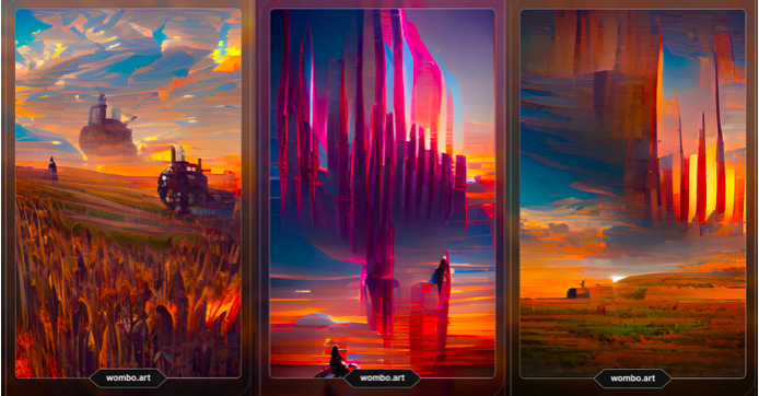
Clive Thompson, a tech writer for LinkedIn’s Creator’s Hub shared a fascinating piece last month that’s been lurking in my memory ever since.
The image at the top of this post was created using AI to produce visuals to Emily Dickinson’s Poem “Because I could not Stop for Death”. After choosing an assortment of particular style of visuals, Thompson fed the poem line by line into the "Dream" generative tool, And out popped those stunning images. As Thompson explains, “The AI’s try earnestly to depict what you described, but they filter it through an inhumanly vectorized form of machine perception that has no clue how the world actually works.” So out pops the amazingly weird visual responses.
In fairness, Dickinson’s poetry can also be considered strangely hallucinating - “tell the truth, but at a slant”, after all. And there’s some serious “slantage” happening with the Dream tool!
How could you use this particular tool in a meeting? You might have to take a bit of time experimenting, but you could get imagery by feeding specific problems, and the emotions they generate into “Dream” - for example, feed in a sentence like: Our supply chain issues are STILL not improving! Or “Our team brought their A Game to the marketing plan for ACE Bioenergetics. Another Contract Coup!
For me, I don’t really have the budget for the higher tech options, stunning as they are. This means I’m really looking forward to the ATD topic: “Working Across the Table or the Globe: How to Use Visual Image Cards to Create Deeper Connection” on May 17th. Sign up here, and I hope to see you there!

